

Hello!
Welcome to my super cute new blog design. I haven’t been this excited about my blog since the launch of wanderlass logo 5 years ago. And before that was 8 years ago when I registered the domain wanderlass.com
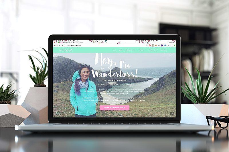
If you’ve been a long time visitor of Wanderlass, I’m sure you’ll share my excitement on the refreshing new look of the site. If you’re visiting for the first time, I hope you’ll stay a while and look around. But let me briefly introduce myself and my blog.
My name is Lilliane, also known as the Wanderlass on the internet. I started blogging in 2007 during the planning stage of my first solo trip and first time to Europe in 2007. It began as a mean to update family and friends on my Euro trip. But because of the positive response I got from readers (other than family and friends), I was inspired to continue sharing stories. Let me also answer a question I’ve been asked so many times.
Am I a Professional Blogger?
No. But I’ve certainly thought about it before. I quickly learned though that it takes more than writing regularly to be a successful blogger. And the fact that I’m not even able to write regularly, we know it’s not gonna happen for me. The pressure gives me skin rashes!
So I’m happy to be blogging when I can. That’s why I have so few posts on my archive considering the age of my blog. But I do have the my most memorable adventures in here, like diving the Galapagos, bungee jumping for the first time, sleeping in a bedouin cave, and many others, especially during my trip around the world.
With the new blog design, I hope to be inspired to write more often. Now let me talk about my new blog design.
The Road to the New Blog Design
The just retired blog design was trendy 5 years ago: the margin on both sides, a slider, and side bar for widgets. I designed it myself using the customizable Canvas theme from Woothemes. It worked very well for a long time but it’s long due for an update.
I’m so bored and have been planning the redesign for about 2 years now. I’ve seek help from 2 talented designers, but somehow despite the beautiful design presented, it’s just not exactly what I wanted. The problem of course is I don’t know exactly what I wanted. All my ideas were abstract.
My design goal is Airbnb website’s long scroll, parallax effect, video clip cover, and sectioned pages. As for the look and colors, I created a Pinterest board to bookmark my inspirations. What I needed is someone who can tie this all together.
:happtone design:
I tried myself, but I can’t. Although after doing a lot of research, I’ve figured out the User Interface (UI) I wanted, more or less. I still needed the aesthetics side of the design. This is really important to me. One day I stumbled upon a blog called TravelinBoots.com which is a blog by another Filipina. 6 months ago, the site look a little different than today. The design then was a bit hipster with typography and filtered photos which I quite like. So I decided to get in touch with the designer.
Happtone Web Design and Development is a brand new Filipino company by Sabrina Lajara, the chief designer and programmer. You’ll see that it’s so new their website is not even ready yet. Happy that she agreed to work on my blog before theirs. Happtone is going to launch within the next couple of weeks.
The experience working with Sab is Fab! She was able to bring together my disorganized abstract idea into a really beautiful design. When she showed me a draft of the new blog design, I knew Wanderlass is going to have a new look very soon!
She is also brilliant with coding. I’ve decided long ago that I wanted to use the monstrous DIVI Wordpress Theme to build my blog because it looks so amazing. And the video tutorial makes you feel like you can do it yourself. But honestly, you can’t. So even if Sab have never ever used DIVI in her programming life, she agreed to learn it and use it instead of a theme she developed.
The Wanderlass New Blog Design
Apart from being pretty, my new blog design is intuitive to navigate and indexed so that it’s easy to find everything, including old blog posts. The slides show some of my most used tags, sort of a mini theme that tells you what I’m mostly into. I went back to all the blog posts and tagged them correctly. Actually, it’s not true, because I’m still fixing the tags. But hey, I finally realized the relevance of tagging. Luckily I only have about 250 posts!
What I’m also really excited about is the Interactive World Map! Just hover over the map and it’ll show countries I have blog posts on. I’ve been to more countries but sadly I don’t have posts on all of them! I also love the cotton candy colors that separated the continents. If you also noticed that Russia is wrong and should be half Asia and not entirely Europe, this is a Google Map issue I hope they fix soon.
Thank You for Visiting!
I hope you enjoy browsing around this new blog design. We just launched it an hour ago, so we’re still observing it for glitches or broken links, etc. If you find everything loads very slowly, we’re fixing that too, because DIVI is such a huge monster. And if you find something else, please let me know on the comment section below.
Or please write something anyway. Think of it as a guest book when you attend an event opening or something like that!


It’s so pretty! :)
Thank you Teesh :D